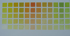
Here's the first of the color charts. Cadmium Lemon.
Some observations and some surprises:
First, Cadmium Lemon is a color I don't use too often since it seems a bit harsher than all the other Cadmium Yellows available- pale, light, medium, deep and other warmer yellows, like Indian Yellow which I use a lot. It's not a color I particularly like on it's own. One of my instructors even cautioned me about using it in the same painting with the other cadmium yellows since he felt it would disrupt the harmony( I am not sure that is a correct conclusion or just his opinion).
However after doing this chart, I see that it can create many beautiful, subtle high key colors. I was able to get some really high key colors without them getting too chalky, even thought the lightest mixtures had a fair amount of pure white in them. Also, by the time you add a lot of white ( the bottom row), the color distinctions between mixtures become very minor.( i.e. there are many ways to get a light, neutralized yellow if you don't have the exact 2 colors)
Many of these colors would be great for sunlit flowers and leaves instead of mixing green with white.
There was value in doing the exercise of starting with one color and then adding just a touch of the 2nd color so the first color retained it's general hue. I will pay more attention to the order of mixing
(generally I just grab the 2 colors and mix them together, but I see I can be more discerning about that in the future)
Also some other colors I use- like Naples Yellow Light, appear to be achievable thru colors mixed here.
And definitely label the chart with Sharpie as soon as you're done and have the tape off- It was hard to tell the difference between Cad lemon and Magenta vs Transparent Red oxide for example, so I had to go back to remix to figure out which was which.
I was shocked how little difference adding the Magenta made- it kind of approaches a yellow ochre type color. ( later hypothesized that because Cad Lemon is opaque and Magenta is transparent, the opaque had greater covering power and hence the lower relative tinting strength of the Magenta)
Do you see anything else that is surprising to you? Click below on comment if you'd like to share something.
We'll see how this compares to the next chart which will be Cadmium Yellow Light.
A friend asked why I would go thru the trouble to do these charts, which can appear tedious in nature
( figure 12 colors mixed with 12 colors x 5 values is 720 individual paint swatches- at this point I can get a job with Sherwin Williams!)
I compared it to practicing scales for a concert pianist or Olympic athletes who train daily. If you want to get good at something it takes practice, practice, practice. The repetition of small actions, especially on the fundamentals, build a familiarity and hopefully mastery over time. While you can certainly learn something from every painting you do, sometimes a focused concentration can accelerate and deepen the learning.
I ran across a quote that expresses this nicely:
"Discipline of study becomes freedom of expression"

Pat this is very interesting and helpful. I would love to see a photo of this Cad Lemon chart with the labels.
ReplyDeleteAlso, how do you know how much of each color (as you go vertically) to mix? Thanks!
Hi Judy- Happy 4th! I just posted the chart with the labels and also a list of the colors mixed in across 12 columns. There is also some background on this project and how to get started, if you want to do it, in my blog posts for the past 2 days. It has definitely been worthwhile and, believe it or not, fun! It's one of those things I saw years ago and said I'd do "someday" but never focused on- but I've committed that now is the time!
ReplyDeleteI just discovered your site through this color chart project (via an old episode of Artists Helping Artists) and I can't wait to do this myself. I've painted here and there in acrylics and need to do this for those paints but what has me all excited to do this right away is that I just bought my first set of oils for an online class I hope to be taking in January. Thank you for taking the time to to do this and share this. I hope to get my hands on that book some day too!
ReplyDeleteGreat Lisa, Glad it's been helpful. Best of luck. If I can be of any help in your artistic journey, please be in touch
Delete