Sunday, July 31, 2011

Wrap Up: Richard Schmid "Alla Prima" Oil Painting Color Charts, Video Clip

If you have been following my blog this month, I started on July 1st  sharing my intention to complete the full color chart study as recommended in the Richard Schmid book, "Alla Prima".

It is something I have been thinking about doing for years, even started a half hearted approach a few years ago, taking short cuts- like not doing all the colors, or the values (and of course that just short changed my learning). So I decided to commit to "do the work" the way is it was designed to be done.

 It took about a week of painting time focusing on this (and you can do it in your own timeframe or spread it out over time it that works best  for you). I  have now completed the initial 12 charts plus a couple of others that I thought might be interesting or useful for the type of subjects I paint which are typically landscapes, florals and gardens (lots of greens).

 I learned a lot by doing the study and have shared each chart and my observations along the way as well as tips on how to get started doing the charts, materials etc... on blog posts throughout this month.  You can use any of this as a reference or  maybe even inspiration for yourself by checking the listings in my Archives for the month of July 2011. Everything related to this project is is concentrated in the posts during the month of July.


Beyond the value of the experience of doing the charts and learning along the way, I now have a wonderful  "color bible" that I made for myself and am now using as a reference for paintings in my studio.

 I have posted a short video clip on YouTube which shows how to make the charts, as sometimes seeing and hearing about it sinks in more than just reading about it.

 If you'd like to see that video go to  Pat Fiorello Oil Painting Color Charts.

Thanks for allowing me to share this project with you. I hope you are inspired to take on a project of your own. What could you focus on to challenge yourself or take your art to the next level?

 I was at a music event last night and saw a young man with this quote on his t-shirt and thought it was pretty fitting for artists too:

"We are what we repeatedly do. Excellence, then, is not an act, but a habit."
Aristotle

So go paint, paint, paint.. and have fun along the way!

Friday, July 29, 2011

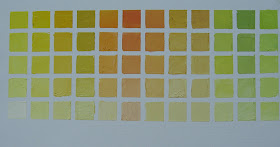
One last color chart: Terra Rosa

I decided to do one more chart on the color Terra Rosa. This is the last of the charts for now. Thanks for following along this month as I completed and shared these studies

I have this color paint but rarely think to ever pull it out so didn't know much about it's characteristics.  I thought this would be a great way to see what it can do:


It is opaque, kind of a combination of a Burnt Sienna with a touch of Permanent Rose- a little pinker than an Indian Red. It mixes up with the yellow well to create a nice range or terra cotta like colors( I guess hence the name terra rosa). Would be great for buildings, many of those European villages and architecture.  Very subtle with the pink and magenta and a nice neutral with Ultramarine Blue( next to last column)

The complete set of color studies is available on this blog, look in archives for July 2011. The first post was on July 1.

Thursday, July 28, 2011

Color Study- Complementary Colors

While not part of the original color study exercise I did, I got inspired to do some other studies that would be helpful references to have on hand. This one has the basic 9 step value chart in black and white, and then 4 combinations of complements to get neutrals.


 The pairs I chose for this study were:

 Ultramarine (UB) and Transparent Oxide Red (TOR)
Permanent Mauve and Yellow Ochre
 Viridian and Permanenet Rose
 and Thalo Green and Alizarin

 I started with one of the pair right out of the tube at one end of the top row and the complementary color at the other end, then got a middle mixture ( middle column) and then skewed one version warmer and one cooler . Once I had the top line, I added white in rows below to get a couple of other values of each of the neutrals.

For example- the "T" on the upper left is
 Row 1 the 5 boxes are:   Pure Ultramarine, UB & TOR( skewed cooler) , the middle mixture of UB and TOR, a warmer mixture of the 2 and the pure Transparent  Oxide Red. Then I took the 3 mixtures and added white to each one to lighten in row 2 and then in the 3rd row added even more white for another lighter value of the same mixture. To get a range of temperatures and values of a neutral from each pair of complements.

 I repeated that same approach for the other 3 pairs of complements.


On the bottom of the page I tried 2 different combinations of red/ green. I learned that the Viridian was so weak in tinting power vs Permanent Rose it was hard to keep it greener( the pinker tones dominate). The Thalo Green/Alizarin combo on the right was easier to get colors that read more like true grays.


Tuesday, July 26, 2011

Oil Painting Color Charts - How to Mix Green


While not part of the original color studies- I thought it would be a good idea to learn more about options for mixing greens. There are so many possible combinations, it would be hard to get them all on 1 chart so I had to narrow them down. I also had to forgo adding white to the mixtures ( I tried dividing the squares but the 1 inch squares divided in two became too small to really get a good read on things.

This was a different set up than the other charts.
 Here I picked a range of greens and blues down the vertical axis and then mixed them white( column 2)  and then a range of warmer colors- yellows, oranges, reds on the horizontal axis.

 The colors I used were as follows:

Cadmium Green  Pale( Winsor & Newton)
Cinnabar Green Deep( Rembrandt)
Olive Green( Rembrandt)
Viridian(Holbein)
Pthalo Green (Gamblin)
Sevres Blue(Rembrandt)
Ultramarine Blue(Rembrandt)
Indigo(Winsor & Newton)

mixed with each of the following:

Titanium White( Lefranc)
Naples Yellow Light( Winsor & Newton)
Cadmium Lemon Yellow(Rembrandt)
Cadmium Yellow Pale( Winsor & Newton)
Cadmium Yellow Medium(Rembrandt)
Indian Yellow(Winsor & Newton)
Yellow Ochre( Winsor & Newton)
Cadmium Orange( Winsor & Newton)
Cadmium Red Light( Holbein)
Terra Rosa( Winsor & Newton)
Transparent Oxide Red( Rembrandt)

Generally, when mixed with yellows, the greens and blues yield  brighter, more springlike greens. When mixed with the oranges, reds, browns, you get more earthy, darker, rich greens. Also mixtures with Cadmium Lemon, Cadmium Yellow Pale and Cadmium Yellow Medium were not radically different so relax if you don't have the specific color you are looking for. You can get pretty close with some minor adjustments. A great array for landscape and floral paintings. However, I view this as a first cut on green, because I expect the addition of white to these mixtures will yield many options which may be subtler perhaps- more neutralized and a bit cooler. Thats' an experiment for another day.


For those interested in mixing greens in watercolor, I have a shot video posted on you tube.  Many of the pigments are the same, so similar principles apply.  Click on Painting Natural Greens in Watercolor


Sunday, July 24, 2011

Painting Glass and Silver- Reflections

Sugar Bowl & Spoon
6 x8 Oil Painting by Pat Fiorello
 Amanda Lovett's workshop 7/24/11


This weekend I participated in a fun workshop led by oil painter Amanda Carder Lovett in Atlanta. The topic was on Painting Glass and Silver. I have long admired Amanda's work and thought the focus would be great since I'm doing a lot more still lives lately.

We did a fun exercise the first day which helped us to slow down and really see shapes, edges and values instead of objects. Each student had small several rectangles of a painting to paint. Our assignment was to target the same colors, shapes, edges, values as a same sized reference photo. Once everyone was finished, we put together all the pieces (which were numbered on back) and saw the whole image come together. Even though 9 different artists painted various pieces, not knowing  exactly what they were painting the whole thing came together. ( see below)


A key lesson was not to think of glass or silver ( or any reflective surface) as what we know it to be- but to look for the shapes . That  advice can apply to painting anything, but especially good reminder for  some of these reflective surfaces which can be intimidating to paint if you haven't done them much before.


Here's a photo of Amanda doing a demo of salt & pepper shakers.


Here I am with one of my paintings from today. the photo has got some glare, so below is a photo of the study.


It was a great workshop and Amanda shared not only her painting experience, but also a wealth of practical tips on materials, set up etc.. tried and true tips to help us deal with the tools of painting with ease so we can get on with the important part- the joy of painting!

Saturday, July 23, 2011

What I learned from doing the color charts Richard Schmid suggested


If you've been following my blog the past few weeks, you know I've been spending time this summer to hunkering down and doing the comprehensive color studies recommended by Richard Schmid, in his excellent book "Alla Prima" He did them over 40 years ago and feels they are invaluable learning tools.

 I  had always wanted to do them "someday", but the task seemed daunting. But while I had some time off this summer from teaching my regular painting classes, I commited to completing them.   I took it on as my own "Independent Study Color Intensive" to understand color mixing at a deeper and more "hands on" level than just knowledge about color theory.

I embarked on this with a little trepidation since it was a big undertaking, but I concentrated my efforts and completed the basic 13 charts and a couple of others I came up with which I thought would be helpful to adds ( i.e. neutrals and greens) in just one week.

In the archives of this blog for July 2011 ( listed in the right column) you can find past posts describing the process, how to get started, materials needed and my observations from each of the individual charts, but taken in total, there were some general learning that were also worthwhile.


 Here are the top 10:

10) I overcame my fear of white. Being trained initially as a watercolorist I never had to use white till I started painting in oils.  I considered it a "necessary evil"  that's only purpose was to lighten a color.  I tried to avoid white at all costs as some of my initial attempts at using it ended up chalky. Thru these charts, I quickly learned that some color combinations ( especially transparents)  need some white to give them body, covering power and make the color apparent.  Also white actually alters the color and temperature ( cools)  so it transforms colors, beyond merely lightening them. After mixing close to 1000 swatches including white, I  not only feel a lot more confident about using white, but see how vital white is. It really can create some wonderful nuanced tints of colors- which are especially evident in the bottom row of each chart( the one mixed with the most white)

9) I saw how harmonious each chart was since all 60 swatches on that page included some of the main color. Might be something to integrate more in my color choices in future paintings.

8) Gained speed in mixing colors and wielding a palette knife- Also appreciate how clean colors stay  when mixing with the knife. I typically switch between mixing with a brush or knife( depending on what I have in my hand or if I remembered to even take my knife out) , but I plan to use the knife more consciously and consistently. Also came up with a handy approach to use 2 knifes- one for  color and one for white to keep my pile of white paint totally unadulterated and pure.

7) Gained a greater ability to control value changes by having to mix multiple values of the same colors.

6) Gained a greater appreciation for the beauty of neutralized colors, especially the very high key tints.

5) It was very evident that color reads the strongest in the middle value range and most of the lightest lights looked very similar- in other words the hue distinctions were not as apparent in the lightest lights.

4) It doesn't take much to add a hint of color to white- so when going for the highest keys, start with white and add a touch till I get to the desired value and color.

3) Opaques tend to swallow up transparents

2) You really can mix most of the colors you buy from a few of the basics- over time I plan to cull down my supply of paint tubes .  If I run out of something like Yellow Ochre, I can mix a close substitute. Also discovered many color combinations that were beautiful that I would never have thought of mixing together- like Viridian and Magenta and White.

And the #1 thing I learned from the color studies...


1 ) There are truly endless color possibilities in each tube of paint!


 I can't deny it was a lot of work, but it was fun as a sense of  discovery and wonder would build, especially with combinations I was not as familiar with. "I wonder how this mixture will look?"
 I now have the best reference  book on color- once I created and experienced first hand. Last night I cleared a space in my studio to keep the book of colors out and available for use during painting sessions.

Now back to painting to apply what I've learned.

Friday, July 22, 2011

Color Charts #12 Viridian

Viridian is a useful color. It's bark is worse than it's bite. It looks very strong on it's own, but it has a very low tinting power ( especially when compared to the stronger thalo green which looks similar in hue but is much more stronger in mixes). Viridian adds a subtle green to it's mixing partners without overpowering. Its offers a way to neutralizing colors without altering them too much.


When combined with a little Cadmium Red, it produces an almost perfect grey. And I never would have thought of adding it to Magenta to get a lovely range of lavenders- but it works (column 9). I've concluded this is a very handy color to have on your palette.

 The Holbein brand of Viridian seems to be particularly rich- that's my favorite brand for this color.  Beware of paints labeled Viridian "hue". The notation "hue" on a paint label often indicates that the manufacturer has found substitutes to mix together to simulate the desired color. It can be similar (and is usually cheaper) but sometimes can be radically different. I've bought Cobalt Blue Hue before and it was more like a thalo blue than a true cobalt- so be careful with those "hues"

If this is your first visit to my blog, see the July 2011 Archives for other colors in this study. This is the last of the 12 basic color studies from the "official" color study plan, but this process prompted me to do a few other charts which I thought might be really useful, so stay tuned ( all will be posted by the end of July).

Thursday, July 21, 2011

Color Charts #11 Ultramarine Blue

This is the chart for Ultramarine Blue.

I swear I wasn't drunk when I did this chart- but it does have a definite expansion towards the right. Guess I had slipped up on the taping after doing 12 charts.

The results from this study aren't much different from the Cobalt Blue chart- just darker and the color combinations are a bit warmer ( reflecting the slightly redder tone of Ultramarine Blue compared to Cobalt Blue). Hence the greens are slightly more neutralized, the oranges yield a colder brown and the pink & magenta columns( 8 & 9) are bluer lavenders than the more orchid like colors in the Cobalt Blue mixtures with those same colors. I'll repeat the Cobalt Blue chart here for comparison purposes.


If this is your first visit to my blog, see Archives for other colors in this study( there will be 12 in all) and stay tuned for the upcoming color studies.

Tuesday, July 19, 2011

Color Charts #10 Cobalt Blue

Here's the color chart on Cobalt Blue- mixed with the same array of colors as all the previous studies.


This entire chart is noticeably cooler and darker than the others so far which is no surprise since the base color, Cobalt Blue is cooler and darker in value than most of the other yellows, oranges and reds from all the previous charts. One of the interesting things to see is how the addition of Cobalt Blue to the yellows      (columns 2-5) makes their properties more evident.   For example, compare the mixture with Cadmium Lemon(column 2) to  the one with Cadmium Yellow Light (column 3). The green produced with Cadmium Lemon looks distinctly cooler (mixing a cool yellow with blue) versus the Cadmium Yellow Light  column which is a warmer yellow mixed with blue to produce a warm green.The 5th column mixed with Yellow Ochre Pale yields a very dull green, almost a grey, since Y.O.P. is more of a neutralized yellow compared to either of the Cadmiums.

If this is your first visit to my blog, see July 2011Archives for other colors in this study( there will be 12 in all) and stay tuned for the upcoming color studies.

Monday, July 18, 2011

Color Charts #9 Transparent Red Oxide

In watercolor, I could not  live without Burnt Sienna, but in oils I have discovered Transparent Oxide Red, which I prefer as it seems cleaner, more transparent, mixes beautifully with other colors as seen below:


Looks like if you don't have Yellow Ochre handy, you can approximate it with T.O. R and yellow.
Also can get some rich darks and warm neutrals, taupes, especially when mixed with other darks like the blues or greens plus white.

If this is your first visit to my blog, see July Archives for other colors in this study ( there will be 12  plus a couple of bonus ideas).

Saturday, July 16, 2011

Color Charts #8 Magenta

Here's the chart for Magenta:


This was not a color included in the Richard Schmid book "Alla Prima" describing how he did these color charts, but I  recently was introduced to this color in a painting workshop and realized how infrequently I include red violet in my work and how useful it can be, so I intentionally included a study of this one to get to know it more.

 First surprise- its transparent. It's not overpowering, just tints other colors. Created some great neutrals when mixed with the yellows (columns 2-5), coral when mixed with orange, amazing color - perfect for orchids, mixed on it's own with white (column 1- look at row 3 & 4), rich rosy pinks with Permanent Rose    (column 8) and gorgeous range of lilacs and lavenders when mixed with Cobalt Blue and Ultramarine Blue     (column 10 & 11), even pretty mixed with Viridian green (last column).

 Very versatile mixer.  I'm definitely adding this color to my regular palette.

If this is your first visit to my blog, see Archives for other colors in this study( there will be 12 in all) and stay tuned for the upcoming color studies. The full listing for colors mixed is in the blog post earlier this month- click on Color charts- How to get started

Friday, July 15, 2011

Color Charts #7 Permanent Rose

This is one of my favorite charts of all:


Fabulous colors for flowers- pinks, roses, lavenders, lilacs- look what it does with blues and white
 ( columns 10 & 11 are with cobalt blue and ultramarine blue respectively)
Transparent, but holds it's own pretty well in terms of tinting power.

While it's easy to use Permanent Rose right out of the tube with white to get a pink, the addition of a small amount of a neighboring color on the color wheel( like Indian Yellow or Cadmium Red) can produce some even richer, warmer pinks- ideal for flowers.


 I much prefer Permanent Rose to Alizarin since it is equally as transparent,  it's permanent and yields some more subtle pinks than I seem to get with Alizarin. Alizarin is darker and very strong to stand up against other powerful pigments like thalo green so it's useful too, but if I could only have one I'd take Permanent Rose.

If this is your first visit to my blog, see Archives for other colors in this study( there will be 12 in all) and stay tuned for the upcoming color studies.

Wednesday, July 13, 2011

Making a Living Making Art

Tuscan Hills
 Oil Painting by Pat Fiorello
SOLD

This is a painting from my travels to Tuscany which I recently sold at a one person show of my Italian paintings series.   As artists, we often wear two hats, creating our work , which is often a solitary activity and then marketing our work, where we need to be looking outward and connecting with others. Often the skills and comfort with these 2 very different activities are not aligned and that can pose challenges for artists seeking to make a living thru their art.

 Today I led a workshop on Developing Your Marketing Strategy for artists who are part of an arts incubator project in the town of Stone Mountain, just outside Atlanta,Georgia. The town is committed to growing it's presence as an artistic center and the incubator project is part of nurturing the development of artists in the community. These artists had the benefit of an live workshop to help them develop their business skills for success, but not every artist has that kind of access, so I thought I'd share a link to a blog hosted by Artists Career Training which offers many resources to artists to help them achieve their goals.ACT's mission is to help artists make a better living making art and they have been doing a great job of that for many years. 
 I have taught teleclasses for ACT in the past  on topics like "Becoming a Self Supporting Artist" and "The Ins and Outs of Juried Shows". Some have been turned into recordings or ebooks which are downloadable. To learn more about what ACT has to offer,
click here.

Tuesday, July 12, 2011

Color Chart #6 Cadmium Red Medium

Here's the latest in the color chart studies, Cadmium Red Medium:


 Like Cadmium Orange, Cadmium Red Medium also has a strong tinting power. It's amazing  the number of subtle distinctions of red and pink that can come from this one paint mixed with just about anything.
Will definitely be pulling out this chart for my rose paintings.

If this is your first visit to my blog, see Archives for other colors in this study (there will be 12 in all) and stay tuned for the upcoming color studies.

Sunday, July 10, 2011

Color Charts #5 Cadmium Orange


Wow- Cadmium Orange seems the strongest so far in tinting power, that is, not being influenced much by  the other colors it's mixed with.  It produced a beautiful array or warm oranges- great for flowers. In this chart I mixed Cadmium Orange with some of each of the same 12 colors I've been using every day in this exercise and it's amazing that even the darker colors like Magenta or Ultramarine blue really can't stand up to the power of Cad. Orange.


But notice compared with even another Cadmium- like Cadmium Yellow Light(  repeating chart 2 from a few days ago below)

that the Cad. Orange retained it's hue pretty much regardless of what I mixed it with while the Cad Yellow was more influenced by the color mixed into it.  Good to remember- a little Cadmium Orange goes along way.

If this is your first visit to my blog, see Archives for other colors in this study( there will be 12 in all) and stay tuned for the upcoming color studies.

Friday, July 8, 2011

Color Charts #4 Yellow Ochre Pale

Here's chart #4- Yellow Ochre Pale- Distinctly different from the other yellows tested as this yellow is less pure and less intense(more neutralized) compared to Cadmium Lemon and Cadmium Yellow Light and even Indian Yellow.


This color is not one of my personal favorites to use on it's own, but one thing that struck me is how  harmonious this chart is. Since every swatch has a bit of yellow ochre pale in it, they all relate beautifully to one another. I started imagining doing paintings that had one color mixed in every other color and thinking how automatically harmonized they might be (and maybe throw in one complement for contrast??)
After completing 4 charts so far, I can see that harmony in each chart- but this one was particularly obvious.

Also  Yellow Ochre Pale yields some really nice neutrals in the highest key( bottom row is mixed with a lot of white) that would be great for backgrounds in some of my floral still lives where I might not want the traditional classic stlye dark background.

If this is your first visit to my blog, see theArchives( right column) for other colors in this study (there will be 12 in all) and stay tuned for the upcoming color studies.

Thursday, July 7, 2011

Color Charts #3 Indian Yellow

I find this color very useful- a transparent warm yellow.


This was the first chart I did with a transparent as the main color. It was very evident that mixing 2 tranparents together look very different than mixing and opaque and a transparent or even 2 opaques. With 2 transparents it took a considerable amount of white to gain any covering power if desired. Or used without white it fan give a warm glow.
 Also Indian Yellow allowed for an overall darker palette with the same color combinations than the other yellows from the past 2 days.

If this is your first visit to my blog, see Archives for other colors in this study( there will be 12 in all) and stay tuned for the upcoming color studies.


Wednesday, July 6, 2011

Color Charts- #2 Cadmium Yellow Light

Here's the 2nd color in the oil painting study: Cadmium Yellow Light- mixed with each of the other colors (no white) in the top row  top line and then fleshed out several values by adding white in the columns below.

Cadmium Yellow Light Study


Definitely warmer and richer than the Cadmium Lemon  study from yesterday. Also since it's opaque, this paint holds up pretty powerfully ( i.e. not  completely overpowered by other colors, even other opaques like Cadmium Red). It makes a nice range of greens when mixed with Cobalt or Ultramarine Blue.

If this is your first visit to my blog, see Archives for other colors in this study( there will be 12 in all) and stay tuned for the upcoming color studies. If you'd like to do your own color charts, see earlier post  on 7/2 which describes how to get started. These studies focus on oil paints, but they can also be done in other mediums.

Monday, July 4, 2011

Cadmium Lemon Chart with labels

 As requested, here's the chart from my post earlier today labeled with the colors mixed in each column. It's pretty hard to see, so if you can't read the labels, the mixtures are going across:


White
Cadmium Lemon
Cadmium Yellow Pale
Indian Yellow
Yellow Ochre Pale
Cadmium Orange
Cadmium Red Medium
Permanent Rose
Magenta
Transparent Red Oxide
Cobalt Blue
Ultramarine Blue
Viridian

Going down the columns- the top row is the main color- in this case Cadmium lemon , plus one other color. then down the column begin adding white to achieve 4 distinctly different values.

The past 2 days blog posts give background on this study in case you want to learn more or try it out for yourself.

 I'll post each of the 12 color charts and observations over the coming days and wrap up with final learnings from the whole process, so stay tuned-  you may even want to take on your own color studies following along with me.

Color Charts- #1 Cadmium Lemon

 I shared in my last 2 posts about the Color Chart study I am working on.
 Here's the first of the color charts. Cadmium Lemon.


Some  observations and some surprises:


First, Cadmium Lemon is a color I don't use too often since it seems a bit harsher than all the other Cadmium Yellows available- pale, light, medium, deep and other warmer yellows, like Indian Yellow which I use a lot. It's not a color I particularly like on it's own.  One of my instructors even cautioned me about using it in the same painting with the other cadmium yellows since he felt it would disrupt the harmony( I am not sure that is a correct conclusion or just his opinion).

  However after doing this chart, I see that it can create many beautiful, subtle high key colors. I was able to get some really high key colors without them getting too chalky, even thought the lightest mixtures had a fair amount of pure white in them. Also, by the time you add a lot of white ( the bottom row), the color distinctions between mixtures become very minor.( i.e. there are many ways to get a light, neutralized yellow if you don't have the exact 2 colors)

 Many of these colors would be great for sunlit flowers and leaves instead of mixing green with white.

There was value in doing the exercise of starting with one color and then adding just a touch of the 2nd color so the first color retained it's general hue. I will pay more attention to the order of mixing
(generally I just grab the 2 colors and mix them together, but I see I can be more discerning about that in the future)

Also some other colors I use- like Naples Yellow Light, appear to be achievable thru colors mixed here.

And definitely label the chart with  Sharpie as soon as you're done and have the tape off- It was hard to tell the difference between Cad lemon and Magenta vs Transparent Red oxide for example, so I had to go back to remix to figure out which was which.

 I was shocked how little difference adding the Magenta made- it kind of approaches a yellow ochre type color. ( later hypothesized that because Cad Lemon is opaque and Magenta is transparent, the opaque had greater covering power and hence the lower relative tinting strength of the Magenta)

Do you see anything else that is surprising to you? Click below on comment if you'd like to share something.

We'll see how this compares to the next chart which will be Cadmium Yellow Light.

A friend asked why I would go thru the trouble to do these charts, which can appear tedious in nature
( figure 12 colors mixed with 12 colors x 5 values is 720 individual paint swatches- at this point I can get a job with Sherwin Williams!)

 I compared it to practicing scales for a concert pianist or Olympic athletes who train daily. If you want to get good at something it takes practice, practice, practice.  The repetition of small actions, especially on the fundamentals,  build a familiarity and hopefully mastery over time. While you can certainly learn something from every painting you do, sometimes a focused concentration can accelerate and deepen the learning.

 I ran across a quote that expresses this nicely:

 "Discipline of study becomes freedom of expression"

Saturday, July 2, 2011

Color Charts- Suggested Materials and How to Get Started

If you'd like the do the color charts along with me, here are supplies that might be helpful.

First the paints- You can use your favorites- just pick a good range from around the color wheel so you'll get a broad variety. The ones I'm using are :


White
Cadmium Lemon
Cadmium Yellow Pale
Indian Yellow
Yellow Ochre Pale
Cadmium Orange
Cadmium Red Medium
Permanent Rose
Magenta
Transparent Red Oxide
Cobalt Blue
Ultramarine Blue
Viridian


You'll also note a palette knife. It is recommended to do the charts with a knife rather than a brush. Some of the benefits- build your knife skills, cleaner color and easier to clean up.


Then you need something to paint on. I thought ahead to how I wanted to use these as a reference in my studio and for future classes, so I wanted some type of book to store the finished charts in once dry.  I  figured out the size I wanted ( bigger than 8 x 12 to allow for more colors- you need at a one inch square for each color) and found a really nice portfolio type binder that was 11 x17 at my favorite local art store, Binders in Atlanta ( and they were on sale 60% off-my lucky day!).  Staples also has basic looseleaf type binders that size but you need to order on line since it's not a very popular size. The closest size Canvas Pads are 12 x 16 so I'm cutting an inch off. I plan to put them in the binder when fully dry in  ITOYA polyglass sleeves just to keep them clean and easy to use- but you could probably just 3 hole punch the canvas pads if you wanted to cut costs.


I also got 1/4 inch artists tape for the lines between columns and rows of colors. I was surprised how well the tape prevented colors from going where they weren't supposed to. For the occasional bleed, I used a Qtip in mineral spirits to "erase" any stray marks before they dried. It is recommended to take the tape off while the paint is wet.

This not that easy to see since the canvas and tape are both white, but if you look closely you'll see a sample of the chart taped off- 12 columns and 5 rows all separated by 1/4 inch tape. I left 1 inch on the top so I could write in which colors I used for future reference.


It takes a bit to get set up, but I am hopeful that the learning and the benefit to my paintings will be more than worth it. Will share what I'm learning along the way, so check back in.
( You can sign up for automatic email for new posts in the column on the right hand side of this blog or just below the comment box)

Friday, July 1, 2011

Color Charts


In concert with the "flower challenge" described in my blog posts the past 2 days, I have committed to take on building a deeper understanding of mixing colors. I've been painting for 16 years, done numerous watercolor color studies and even teach a workshop on "Understanding Color for Watercolor" but I have never done the infamous Color Charts with my oil paints.

The paint colors are pretty much the same between watercolor and oil and even properties, like transparent vs. opaque, are consistent but in watercolor you use the white of the paper to get lighter values and in oils you add white paint ( or other light colors) which is a whole different animal.

I learned about the Color Charts several years ago from Richard Schmid's excellent book "Alla Prima" Richard first did them 40+ years ago when he was learning to paint and says they were invaluable. It  is a time honored approach for understanding color that dates back to a Flemish tradition for teaching painting.

You basically mix every color with every other color and then add white to have create 5 different values of that color. You can do as many as you want but to keep it manageable, I'm following Richard's approach with just a dozen colors. I have substituted a few colors I use often for a couple of his that I don't use that much or were similar. There will be 13 charts in all including this first one which is just unmixed colors straight out of the tube, then lightened 4 more values with white.

I'll share my approach and learnings over the next few weeks as I go along and my next blog will be on materials I'm using in case you want to do this along with me.  I plan to do a short video of the study once it's done, so stay posted for more to come.